

• Logo design
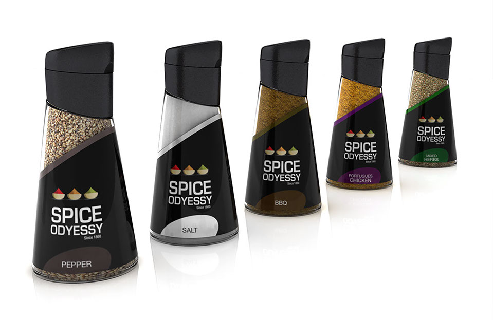
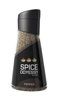
• Bottle design
• Packaging design
• Key visual development
• Point of purchase displays
The objective was to create a brand for an up and coming spice company based in South Africa. the look and feel of the product and brand had to appeal to mothers or the higher LSM, The look and feel would be clean and modern going away from the heritage of spices as its as this is what the competitors focus on. Key Elements needed to be Brand Identity, Bottle design, Packaging design, Key Visual & pop display for Brand awareness in the retail environment.
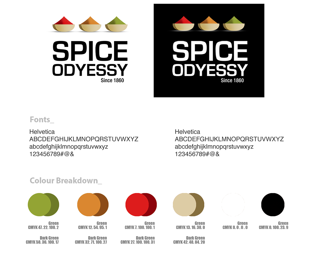
Based on the brief this logo was developed to give spice odyessy a premium look and feel with its simple typography it creates a clean modern look with the spice bowls above helping sell the message of the brand.

The bottle has been designed for a modern look & feel with its uniques tapered shape and soft curves, The lid is high grade plastic with a lockable cap. which can be removed to refill the spice. The Label is a high gloss 4 colour print. A standard bottle is used through out the range.

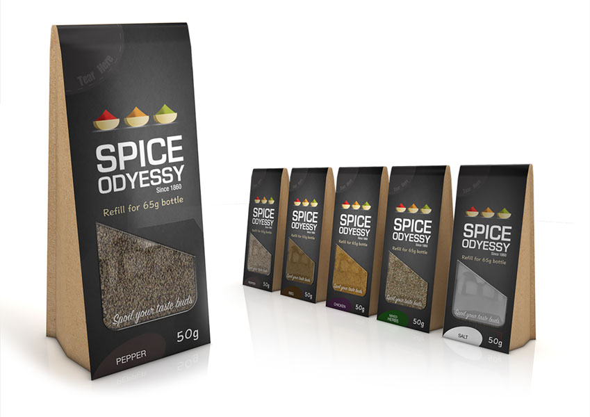
The Refill pack has a modern look with its straight triangular shape. with sample window in the front of the pack to view the spice, Premium 200g board substrate with a high 4 colour premium finish.

The Refill pack has a modern look with its straight triangular shape. with sample window in the front of the pack to view the spice, Premium 200g board substrate with a high 4 colour premium finish.

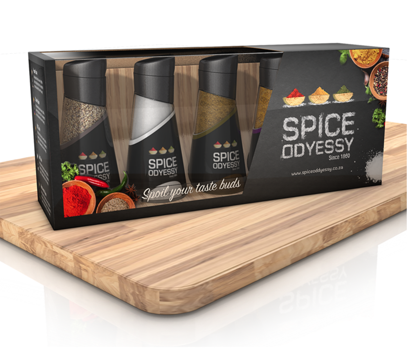
The final packaging design houses the Entire range of spice odyssey bottles as well as the spice rack it is sols as a complete pack with will drives sales. the box is made from a premium board with a clear pst window for product visibility. The pack has a high quality 4 colour print for a premium finish..

The Key visual is based on the Generic look and feel of the Spice odyssey brand. Using different spices to develop the logo helping illustrate what the brand is all about, Quality and dedication. Visual pack shots to increase the product visibility and help promote brand awareness in store.


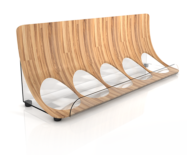
This units main purpose its to drive sales off shelf and increase brand awareness in the retail environment. It is a double sided semi-perm Free standing unit which will have a long life span instore. Its premium finish is made up of a wooden base
structure, Clear Perspex shelving with a high steel 5mm metal tubing to keep product from falling off the artwork is printed and applied on a quality matt vinyl for a premium finish


© 2015 darynmullett. All Rights Reserved